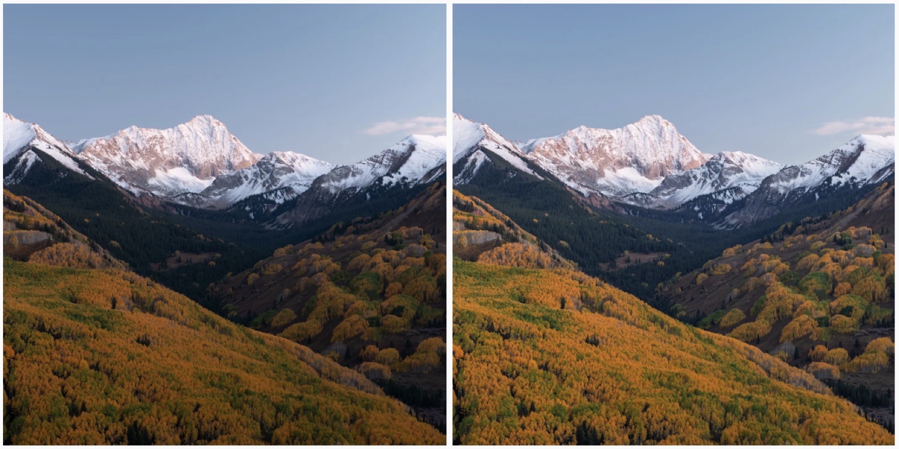
Treat Adaptive Color as a starting rendering
Adaptive Color analyzes each RAW or DNG image and creates an image dependent rendering of tone, color and contrast. It does not move Lightroom's regular editing sliders. It is not a finished edit or a promise of a perfect result.
Sometimes the profile gets the bright and dark parts of a scene closer to the relationship I want. Sometimes it adds contrast, color or local separation that works against the photograph. I judge it by where it puts the edit, not by whether the preview looks more dramatic.
Compare Adobe Color before accepting Adaptive Color
Start with an unadjusted RAW file and switch between Adobe Color and Adaptive Color in the Profile Browser. Adobe Color gives me a predictable baseline. Adaptive Color is the alternative only when its image-specific rendering gets closer to my intended result.
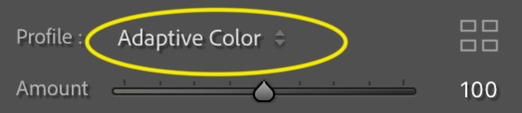
The Adaptive Color Amount slider runs from 0 to 200. I usually compare Adobe Color, Adaptive Color around 50 and Adaptive Color at 100. A useful result often sits somewhere around 30–70; 100 is the default strength, not the correct answer for every photograph.
Compare highlight detail, shadow separation, skin or feather color and the visual weight of the background. If a lower Amount keeps the useful tonal balance without the aggressive color, stop there.
Use bald eagles as a dynamic-range stress test
A bald eagle puts bright white head and tail feathers beside a dark brown body. Adaptive Color can create useful separation in the dark plumage while holding the eye and the bright feathers together. The real question is not whether the image has more pop. It is whether the whites, dark feathers, eye and background now have a better starting relationship.
An eagle in snow or another high key scene is harder. The profile may open the body and balance the snow. It may also push the white head, tail and background toward the same clipped value. Watch the histogram and highlight-clipping warning instead of trusting the brighter preview. If feather texture disappears, reduce Amount or return to Adobe Color.
Judge feather detail in soft and warm light
Overcast wildlife files often contain plenty of recoverable feather detail but little separation. Adaptive Color can provide a faster starting point without immediately pushing Shadows, Contrast and a curve. If the soft light or quiet mood was the reason I made the picture, though, extra pop may solve a problem I did not have.
Warm directional light needs a different check. Golden light on an eagle, owl or fox can already be rich in yellow and orange. Compare Amount 0, 50 and 100 and ask whether the profile is enhancing the light or changing its character. Watch warm feathers, grasses and reflections before adding more contrast.
Inspect backlight, wet plumage and green habitat
Backlight and rim light give Adaptive Color a large tonal range to work with: bright sky or water, a glowing edge and shaded feathers. The profile can establish that balance quickly, but inspect the head, wings and fine branches at 100 percent for halos, edge artifacts or abrupt local transitions.
Wet plumage, moss, summer foliage and bright grass can also become too saturated. If the greens or reflected color become the loudest part of the composition, reduce Amount or switch profiles. More color is not better when it pulls attention away from the subject.
Check adjacent burst frames before syncing
Adaptive Color analyzes every image independently. A small change in wing position, background or reflected light can change the rendering across adjacent frames, even when the exposure and light look consistent.
After choosing the best frames from a burst, compare them one at a time before synchronizing the rest of the edit. Check the white head and tail, dark-feather separation, saturated backgrounds and subject edges. Do not assume one Amount will render every winner identically.
Keep landscape and night scenes in the comparison
Adaptive Color is not only a wildlife profile. It can be an effective starting point for an HDR landscape with a bright sky and dark foreground, but the same checks still apply. Look for clipped clouds, exaggerated local contrast and a foreground that no longer feels connected to the light.
- Wildflowers: watch greens, magentas and small saturated color patches before adding Vibrance.
- Fog and mist: protect the quiet tonal separation and atmosphere instead of forcing clarity into the scene.
- Blue hour: keep the cool-to-warm color relationship believable; opening shadows is not the same as correcting color.
- Milky Way foregrounds: test Adaptive Color on the landscape RAW, then keep the foreground consistent with the night sky and the other frames in the blend.
Use this quick Adaptive Color decision table
The profile is worth testing when it reduces the distance between the RAW rendering and the finished photograph. These are the first places I look before deciding whether to keep it.
| Photograph | Adaptive Color may help | Watch for |
|---|---|---|
| Bald eagle in harsh light | Balance white head and dark body | Head or tail clipping |
| Eagle in snow | Open plumage while holding a high key scene | Flat or clipped whites |
| Overcast wildlife | Separate feather tones | A quiet scene becoming too punchy |
| Warm directional light | Build color and tonal richness | Over-warmed feathers or reflections |
| Backlight or rim light | Balance the edge, sky and shaded subject | Halos and edge artifacts |
| Wet bird or green habitat | Separate subject from background | Oversaturated greens |
| HDR landscape | Balance a bright sky and dark foreground | Over-processing or clipped clouds |
| Fog, blue hour or night | Establish subtle tonal separation | Lost atmosphere or unnatural color |
Put Adaptive Color early in the workflow
Adobe recommends applying an Adaptive Profile before other adjustments and does not recommend combining Lightroom's Auto setting with an Adaptive Profile. I choose one starting interpretation, set its strength and then build the edit deliberately.
- 1. Cull: use Assisted Culling to remove technical failures and find the frames worth judging.
- 2. Organize: use Auto-Stack to group each burst or bracketed sequence.
- 3. Choose the starting profile: compare Adobe Color, Camera Matching and Adaptive Color.
- 4. Set Adaptive Color Amount: compare a restrained value with 100 instead of accepting the default automatically.
- 5. Edit: set white balance and exposure, then move into masks, curves, color and finishing work.
Update the profile after image-changing tools
If you use, move or delete Remove or Heal work after applying Adaptive Color, Lightroom may ask you to update the Adaptive Profile. The same warning can appear after you rotate or flip the image or add Lens Blur. Use the Update AI Edits control when it appears, then recheck the Amount and the areas that mattered before continuing.
That warning is another reason to choose the starting profile early. The profile depends on the image it analyzes; change that image and Lightroom may need to calculate the rendering again.
When I don't use Adaptive Color
I do not use Adaptive Color merely because it is newer, because it avoids moving sliders or because 100 makes the preview look punchier. I switch to Adobe Color or a Camera Matching profile when Adaptive Color moves the file farther from the photograph I intend to make.
- It flattens deliberate contrast or changes the mood of fog, blue hour or backlight.
- It pushes warm color, wildflowers or green habitat harder than the subject needs.
- It compromises white feather, snow or cloud detail.
- It creates halos, abrupt transitions or another edge artifact.
- It produces inconsistent starting renderings across the selected burst frames.
- Adobe Color or Camera Matching simply gets closer with less correction.
Frequently asked questions
What does Lightroom Adaptive Color do?
It analyzes an individual RAW or DNG image and creates an image dependent rendering of tone, color and contrast without moving the standard editing sliders. It is a starting profile, not a finished edit.
Is Adaptive Color better than Adobe Color?
No. Adaptive Color is more image-specific, while Adobe Color is a predictable baseline. Use the one that puts the file closer to your intended photograph while preserving important detail and mood.
What Adaptive Color Amount should I use?
There is no universal value. Compare Adobe Color with Adaptive Color around 50 and at 100, then adjust. Many photographs benefit from a restrained value around 30–70, but the image decides.
When should I apply Adaptive Color in my workflow?
Choose it near the beginning, after culling and organizing but before your normal tonal, masking and color adjustments. Adobe recommends applying Adaptive Profiles before other edits and does not recommend pairing them with Auto.
Is Adaptive Color suitable for wildlife photography?
Yes, especially when a subject contains bright and dark detail, but inspect highlight clipping, saturated backgrounds, edge transitions and consistency across adjacent burst frames before batch editing.
A useful workflow removes repeated decisions while protecting the choices that make the photograph personal.