
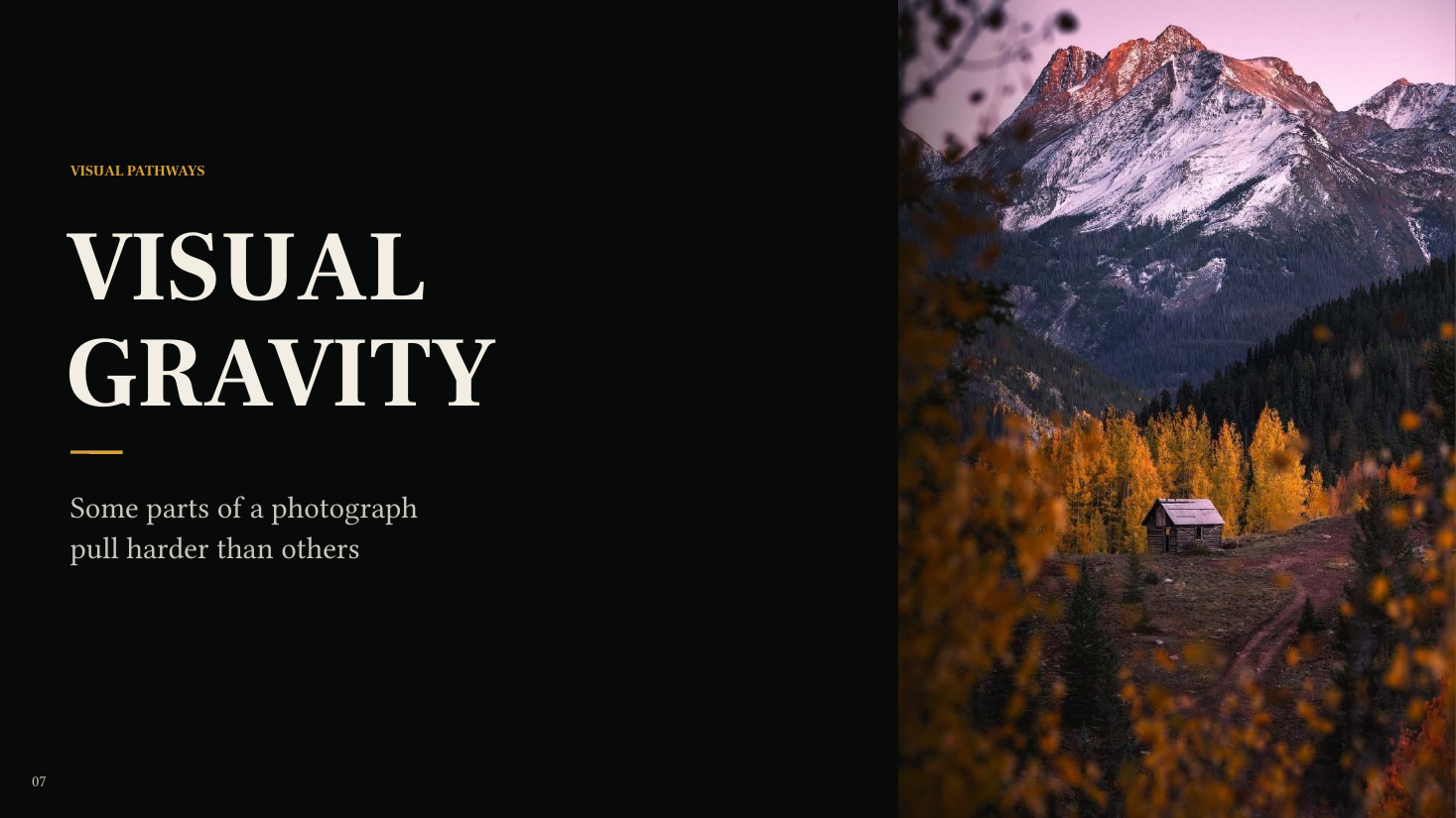
Look at the photograph below for a few seconds.
Do not think about the camera. Do not think about the settings. Just notice your own eyes.
Where did you look first?
Chances are, you did not consciously choose that part of the frame. Something in the photograph pulled you there.
That pull is what I think of as Visual Gravity.
In traditional composition language, you will sometimes hear a related idea described as visual weight. I prefer Visual Gravity because it describes what I actually experience when I look at a photograph.
Some parts of a frame simply pull harder than others.
A bright object inside a dark landscape can demand attention. A warm object surrounded by cool color can separate itself almost immediately. A sharp object surrounded by softness can become difficult to ignore. A tiny human figure can visually overpower a mountain that occupies half the frame.
The biggest thing in the frame is not automatically the most important thing. The thing with the strongest Visual Gravity often wins.
Once I started thinking about composition this way, I stopped asking only where objects should be placed. I started asking a different question: What is going to pull the viewer’s eye, and does it deserve that attention?
What is Visual Gravity?
Visual Gravity is the amount of attention an element pulls relative to everything around it.
The word relative matters.
A bright patch of rock does not have a fixed amount of Visual Gravity. Put it inside an equally bright scene and it may barely register. Put the exact same rock inside a predominantly dark landscape and suddenly it can become one of the strongest elements in the frame.
The same thing happens with color. A warm orange object surrounded by other warm colors may blend into the scene. Put that same orange against blue fog and its importance can change dramatically.
Sharpness works the same way. Detail everywhere creates one experience. One extremely sharp object surrounded by softer information creates another.
Visual Gravity is not simply a property of an object. It is a relationship. And composition is full of those relationships.
What creates Visual Gravity?
Several forces consistently affect where our eyes go.
Brightness is one of the most obvious. Bright areas can pull strongly, especially when surrounded by darkness.
Contrast creates another powerful attraction. Our eyes respond strongly to abrupt changes in tone, color or texture.
Warmth and color separation can cause one part of a scene to visually advance while the surroundings recede.
Sharpness and detail invite inspection. An area with significantly more texture or clarity than its surroundings can become disproportionately important.
Isolation gives an element room to become significant. A lone tree, person or illuminated rock surrounded by negative space can carry enormous gravity.
Scale matters, but probably less predictably than we sometimes assume. A large object naturally carries weight, but a much smaller object can overpower it if enough other forces work in its favor.
Human presence is especially powerful. A person can occupy a tiny percentage of a frame and still become one of the first things we notice. And direction affects attention in a slightly different way. Lines, gestures, repeating shapes and light can push the eye toward another part of the photograph rather than simply attracting attention themselves.
The real power comes when the forces stack
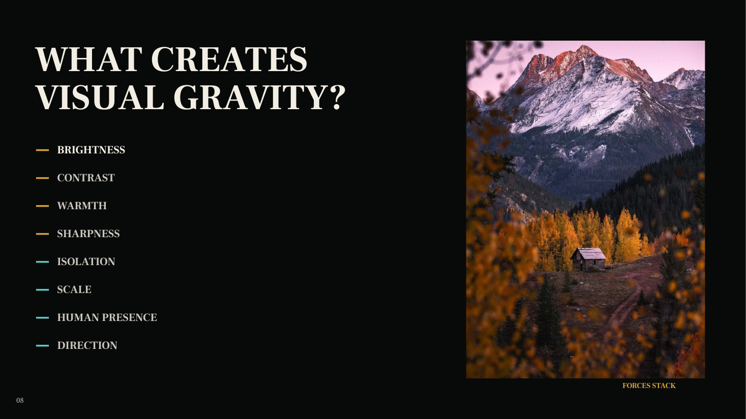
Suppose the main subject in a photograph is slightly brighter than everything around it. That gives it some Visual Gravity. Now make it warmer. Give it stronger local contrast. Keep it sharper than its surroundings. Separate it from nearby objects.
Suddenly you do not have one reason for the viewer to look there. You have five.
Brightness says, look here. Contrast says, look here. Warmth says, look here. Sharpness says, look here. Isolation says, look here.
The photograph is no longer depending on one compositional trick. The forces are cooperating. And when enough forces agree, the image stops asking the viewer to decide where to look. It makes the decision for them.
A tiny subject can have enormous Visual Gravity
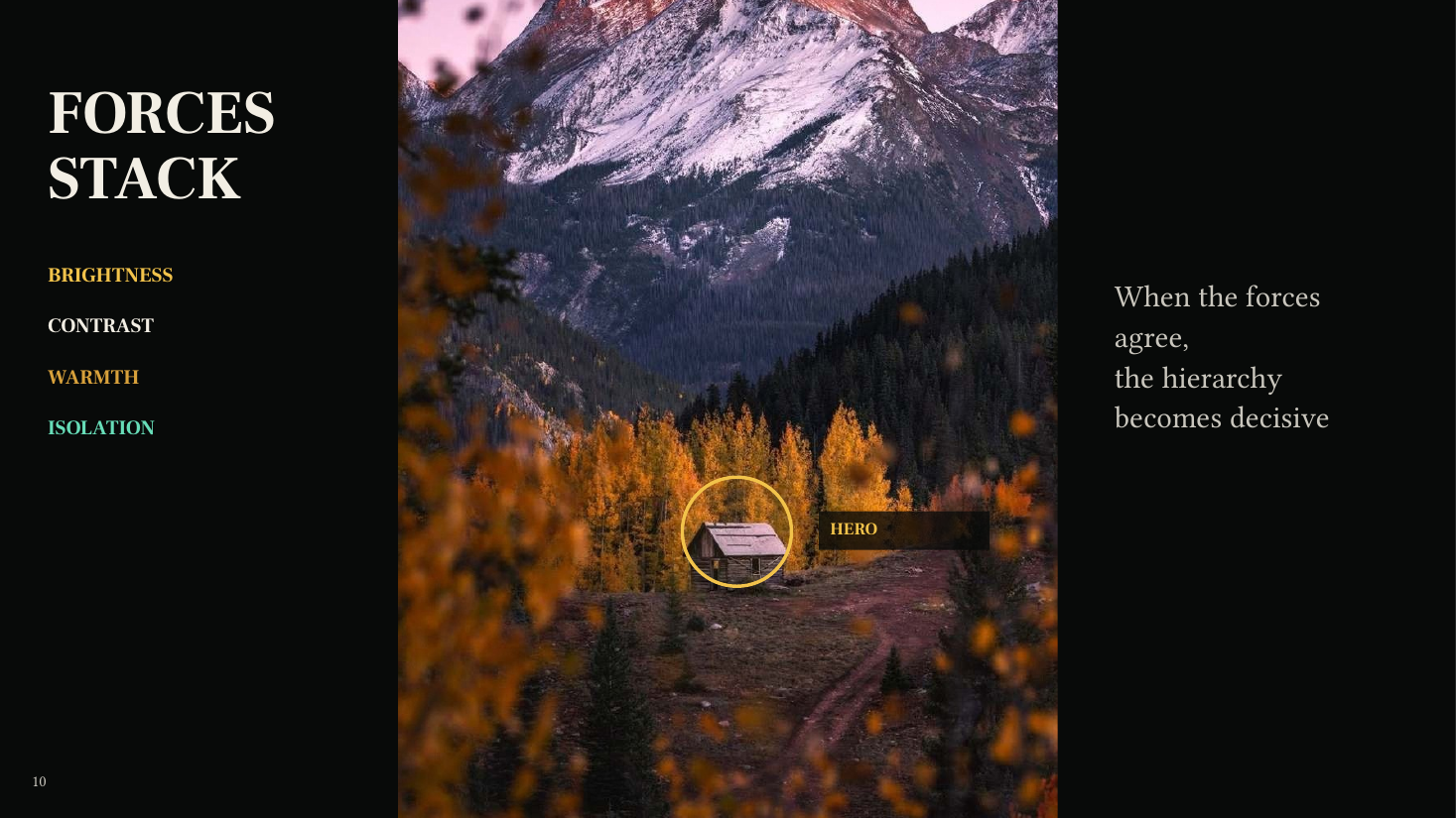
This is one of the reasons people are so powerful inside landscape photographs. The person may occupy almost none of the frame. Physically, the mountains are enormous. The night sky may dominate most of the image. But once you recognize a human figure, it can become very difficult not to return to it.
That does not mean the person automatically becomes the hero of every photograph. It means human presence carries a lot of potential gravity. And once you combine that with isolation, contrast or light, the pull becomes even stronger.
When the wrong thing wins
Visual Gravity becomes even easier to understand when we deliberately break it. Go back to the first landscape. Imagine that the hierarchy is working. The important parts of the photograph are getting the strongest attention. Now brighten an area that does not deserve it.
Nothing physically moves. The mountains stay in exactly the same place. The foreground stays in exactly the same place. The subject stays in exactly the same place. But the photograph changes.
Why? Because the hierarchy of attention changed. That secondary area is now pulling harder than its role in the photograph deserves. I call that attention without purpose.

COMPOSITION CAN CHANGE EVEN WHEN NOTHING MOVES.
Stop asking only, “Is this distracting?”
Photographers use the word distracting constantly. I use it too. But it is not always a very useful diagnosis. Distracting tells us that something feels wrong without explaining the relationship causing the problem.
I prefer a different question: Does this element deserve the amount of attention it is receiving?
A bright object is not inherently bad. A high contrast object is not bad. A colorful object is not bad. The problem occurs when the amount of Visual Gravity it carries is out of proportion with its importance to the photograph.
An insignificant rock receiving enormous attention may be a problem. Your hero receiving enormous attention may be exactly what the photograph needs. The element itself is not necessarily the problem. The relationship is.
Importance and attention should agree
This may be the simplest practical rule in the entire Visual Gravity framework: Importance and attention should agree.
If something is important to the photograph, let it pull. If something is secondary, do not allow it to overpower the hero. If an unimportant element has enormous Visual Gravity, you probably have a hierarchy problem. If your main subject has almost none, you probably have the opposite problem.
That does not mean every photograph needs to feel calm or perfectly balanced. A photograph can be intentionally uncomfortable, chaotic or asymmetric. Hierarchy does not mean everything behaves. It means the distribution of attention supports what you are trying to communicate.
Use Visual Gravity before you press the shutter
This way of thinking is useful long before Lightroom or Photoshop. When a composition feels close, I scan the frame differently now. I look for the brightest small object. I check the edges for bright gaps. I pay attention to isolated warm colors. I look at where the strongest contrast is happening. I notice whether a foreground object I originally found interesting is now overpowering the actual subject. I pay attention to people.
Sometimes the solution is exposure. Often it is not. Moving the camera six inches might solve the problem. Changing your height might separate two objects. Waiting for different light might change the entire hierarchy. Removing one bright edge can quiet an otherwise distracting corner.
For more on depth and visual hierarchy, creating depth and wide-angle composition, these are useful ideas to carry into the field.
Visual Gravity continues in post-processing
The shutter does not freeze the hierarchy. Processing changes it. Brightening an area can increase its Visual Gravity. Darkening it can reduce that gravity. Adding local contrast can increase its pull. Sharpening or adding texture invites inspection. Reducing texture can allow something else to become more important. Warming part of the frame can separate it from a cooler environment.
That means dodging and burning, color work, sharpening and local masking are not simply finishing techniques. They are compositional decisions.
If I lift every shadow equally, add clarity everywhere and increase saturation across the entire photograph, I may be making every part of the frame louder at exactly the same time. Sometimes a photograph does not need more impact. It needs clearer hierarchy.
If you want to work through the visual hierarchy in your own photograph, one-on-one editing instruction can make that diagnosis much more specific.
Try this on one of your photographs
Open one photograph you have already finished. Do not change anything yet. Identify the three areas with the strongest Visual Gravity. Rank them. Which receives the most attention? Which comes second? Which comes third?
Now ask whether that ranking matches the photograph you intended to make. If it does, great. If it does not, do not immediately grab a slider. Diagnose why. Is the wrong object brighter? Warmer? Sharper? More isolated? Higher contrast?
Once you know which force is creating the unwanted gravity, the correction becomes much more specific. Instead of thinking, Something feels wrong, you can think, That bright foreground is receiving more attention than its importance deserves. That is a problem you can actually solve.
Visual Gravity is only the beginning
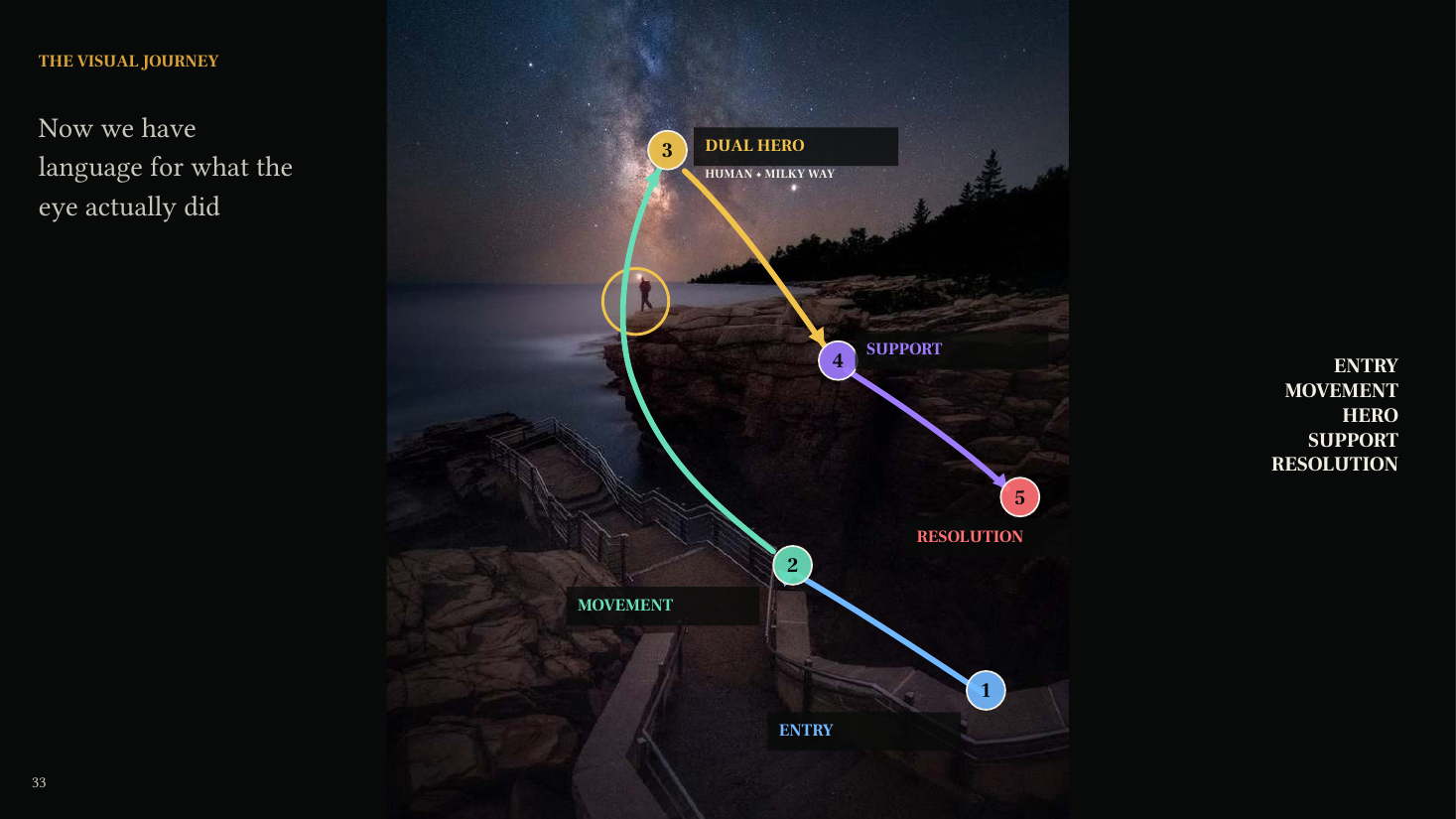
Visual Gravity answers one question: What pulls the eye? But there is another question. Where does the eye go next? That is where the larger idea of Visual Pathways begins.
Visual Gravity helps establish the hierarchy. Visual Pathways describes the journey through that hierarchy: where the viewer enters, what moves them, what becomes the hero, what supports it and where the eye eventually resolves.
Once you begin seeing composition this way, photography becomes less about arranging objects according to rules and more about designing an experience.
The question changes from: Is this well composed? to: Where will they go? And then: Is that where I want them to go?